

Mastering Accessibility with Color Contrast: A Designer's Essential Toolkit
Color contrast isn't just about aesthetics—it's a critical factor in making digital content accessible to everyone. Ensuring adequate color contrast significantly enhances readability and usability for users with visual impairments and is a must for your product to be accessible.
🎨
Let's discover practical tips and tools for mastering color contrast in your designs!
Why Color Contrast is Crucial
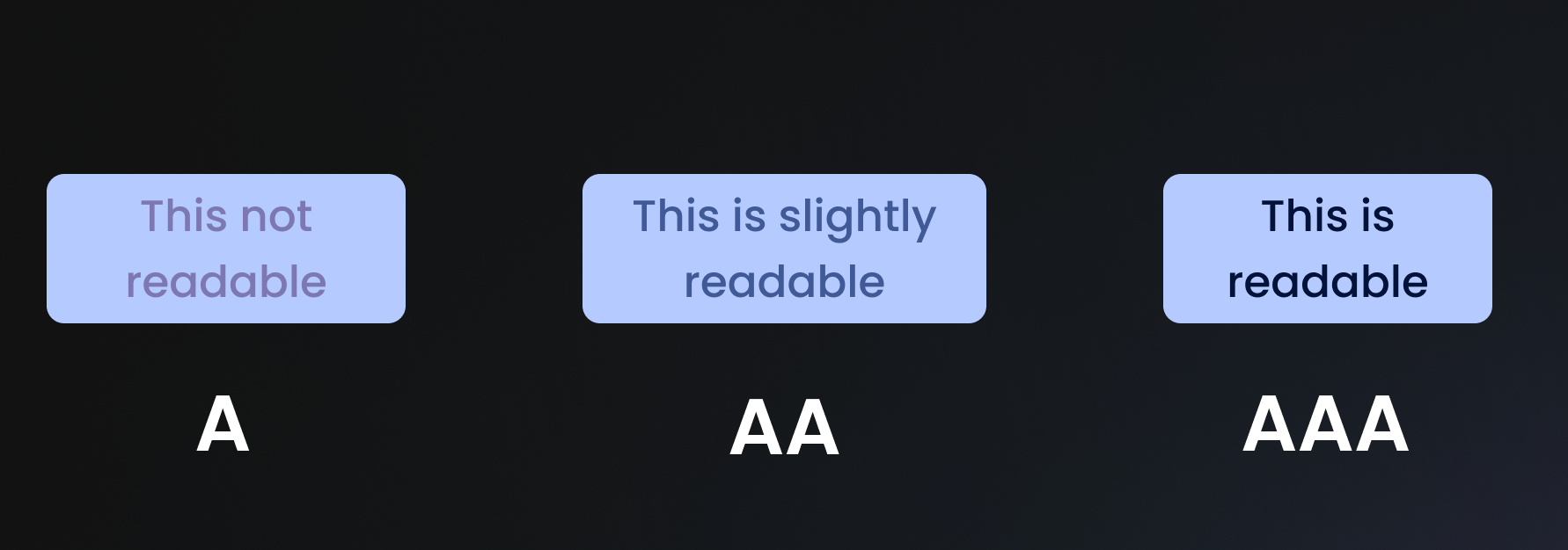
- Enhanced Readability: High contrast between text and background colors improves legibility, making content easier to read for users with low vision or color deficiencies.
- Improved Usability: Clear contrast between interactive elements ensures that users can easily identify and navigate buttons, links, and form fields within interfaces.
- Promotion of Inclusivity: By prioritizing color contrast, designers create digital experiences that are accessible to everyone, fostering inclusivity and equal access to information.
Practical Tips for Implementation
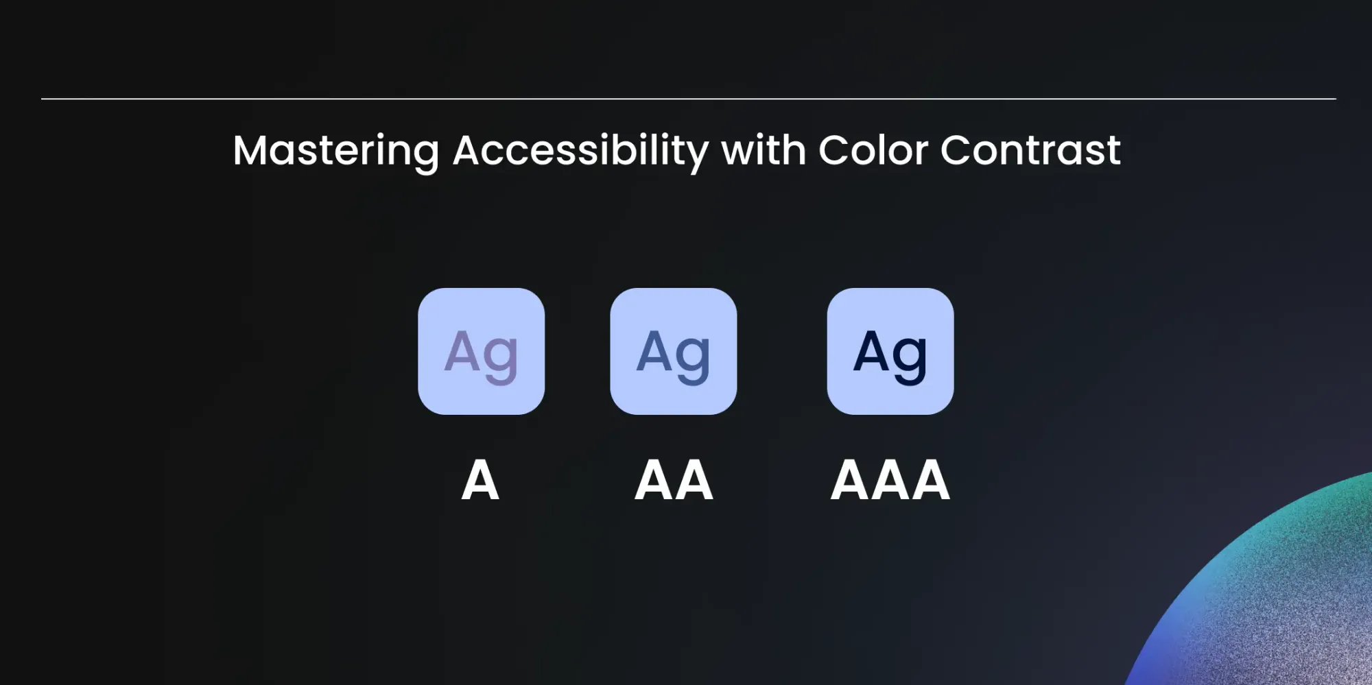
- Adhere to Standards: Familiarize yourself with the Web Content Accessibility Guidelines (WCAG) and ensure that your designs meet the recommended minimum contrast ratios for text and interactive elements.
- Utilize Tools: Leverage online color contrast checkers and accessibility evaluation tools to assess and adjust the contrast levels in your designs.
0:00
/0:12
- Conduct Thorough Testing: Test your designs across different devices, screen sizes, and lighting conditions to verify that color contrast remains effective in various contexts.
💡
Embracing color contrast as a core design principle ensures both visual appeal and compliance with accessibility standards, such as the European Accessibility Act.
A thoughtful approach to color contrast empowers all users to engage with your content, fostering inclusivity and accessibility.