Lean Branding Excellence: MVST's Way

It is no secret that having strong branding with high recognition value is an unbeatable good in today's digital age! MVST is a software development studio with a strong focus on design. So how do we approach a branding process?
As an output-driven studio, we prioritize efficiency and precision in the branding process, avoiding unnecessary delays or repetitive cycles. When a partner approaches us with a design vision, we aim to swiftly deliver results. For us, the brand is intertwined with our partner's digital products to form an impactful identity.
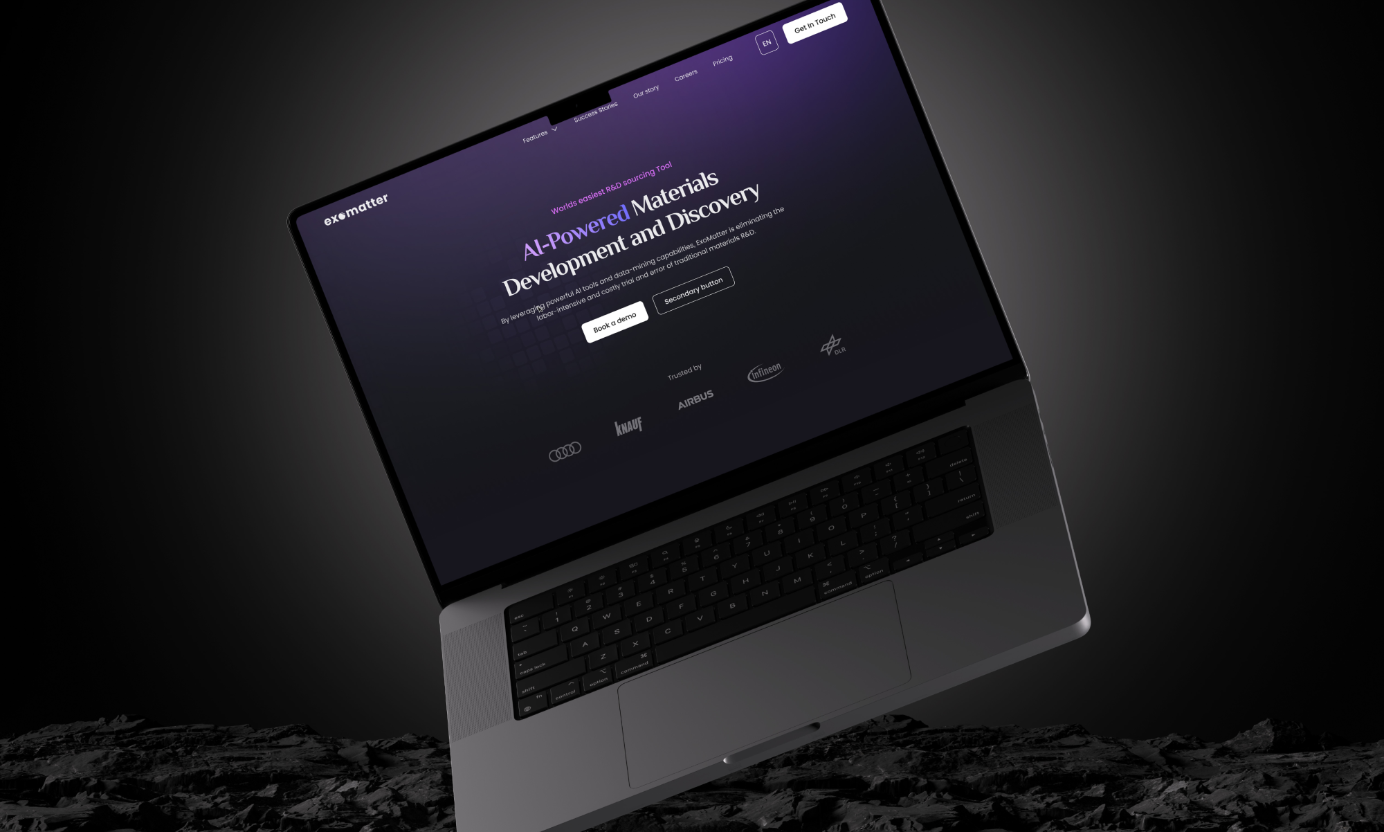
We steer our creative forces towards the most important components, such as logos, various branding elements, and signature colors, recognizing their pivotal role in shaping the user experience and perception of the digital products we build with our partners, whether it's a website, web app, or mobile app
MVST's Lean Branding Approach
Every studio has its approach, however, at MVST, we refined our Lean Branding Process to deliver exceptional digital products quickly and efficiently. Our focus goes beyond just branding to encompass digital experiences that are fresh, unique, and precisely tailored to our partners' customers' needs. Here's how we do it:

Logo Development
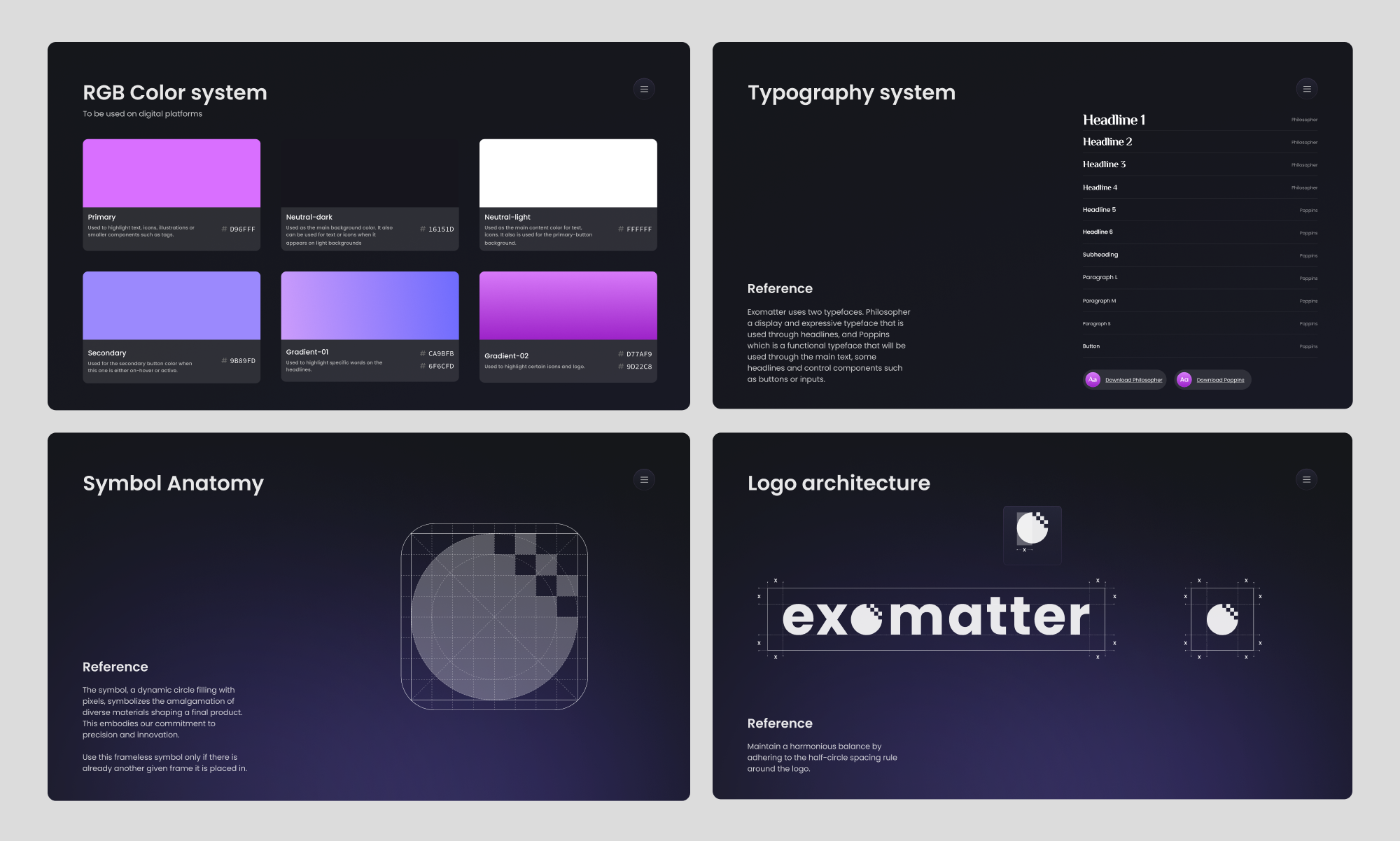
Creating a standout logo is essential for digital products. We don't just design logos; we craft visual identities that resonate with our partners' offerings. By experimenting with styles, shapes, sizes, and colors, we ensure that our logos capture attention and convey the essence of the product or service.
The anatomy and uniqueness of the logo play a crucial role when our partners want to stand out from the crowd. We carefully consider how and where the logo is used within the digital product. One proven way to keep a logo in mind is to integrate it into the word mark, ensuring it becomes a memorable part of the overall branding experience.
Color Branding
Just like selecting the right components is crucial in crafting a high-quality product, strategic color branding sets the tone for digital products. In the digital realm, colors play a vital role in going beyond aesthetics to indicate various functionalities within the product, guiding users seamlessly through their journey.
At our studio, we meticulously curate mood boards and analyze market trends to develop color palettes that go beyond aligning with our partners' vision to enhance the overall user experience. The goal is to create color schemes that differentiate our partners' products from competitors and resonate deeply with their users, ultimately elevating the product's impact and appeal.

Typography
We always ensure responsive design, for the seamless adaptation to various screen sizes and resolutions for consistent legibility across devices. Accessibility is also paramount, with considerations for font size, contrast, and readability to accommodate all users. This is why we carefully select fonts that balance boldness and readability, ensuring headlines grab attention while longer texts remain inviting. We also strategically employ whitespace and layout for a visual flow within the interfaces.
We aim to maintain and strengthen brand consistency as it is key when building digital products; our typography reinforces brand identity through consistent font choices and treatments. This not only enhances user experience but also fosters meaningful engagement. By delving into dynamic typography effects, we unlock opportunities to craft immersive and captivating user experiences, further solidifying our brand's presence in the digital landscape.

Branding Elements
Our approach to branding elements in digital products prioritizes seamless integration into every screen and interaction, ensuring consistency throughout the product and various devices for a cohesive brand experience. We go beyond mere consistency by incorporating interactive components that elevate user engagement.
These components converge to achieve a purposeful design that aligns with the product goal and user needs. This purposefulness is adaptable across all devices, differentiating the product from others on the market.
Art Direction
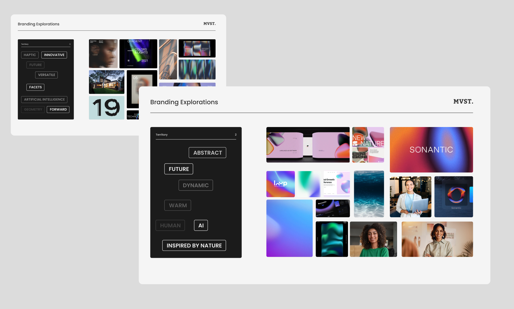
We aim to create a unified visual story that reflects our partner's brand identity and resonates with their customers by asking important questions to ourselves and our partners:
- What's your preferred style? Is it playful, or is it clean?
- What visuals do you consider, from animations to real-life images?
- How many product photos do you want to showcase?
- Pondering over the quantity and significance of product photos to be showcased.
By staying updated on design trends and actively iterating based on feedback from stakeholders and users, we ensure the visual experience continuously improves.

At MVST, we understand that close collaboration with our partners is vital to bringing their visions to life within the Lean Branding Process for digital products prioritizing essential branding elements that deliver maximum impact while minimizing unnecessary complexity.
We engage with our partners every step of the way, collecting valuable feedback to ensure their vision is fully integrated into the design system to see the full product ensuring a seamless transition from concept to implementation.
Before you leave ...
Did you know? We also love to do Rebrandings! One of our Product Rebranding was ShopApotheke/Redcare - Check out the makeover here!

