The Power of Landing Pages: Do's & Don'ts And Best Practices
Appealing and nice-looking landing pages are the digital gateways to success for any business, where the art of conversion truly takes form. But crafting the perfect landing page isn't an easy feat. It's an intricate dance of do's and don'ts that can make or break your online success story. Designers, marketeers, and business owners - if you want to hit the spot and captivate visitors to your website: Here are our best practices for the amazing landing pages.
- What Is A Landing Page And Why Is It Important?
- The Do's
- The Don'ts
- Final Thoughts
What Is A Landing Page And Why Is It Important?
Imagine your website is a grand mansion, and the landing page is the elegant front door. It's the first thing your visitors see and the gateway to the wonders inside.
They're the virtual handshakes that can turn curious visitors into loyal customers, making them an indispensable asset in the digital age. Landing pages are the very first online interaction with your business. As you can imagine, this page has to hit the exact right spot and it must attract the attention of the visitor.
That's why the UI/UX design, as well as the features, have to be flawless. In turns of digital marketing, the landing page is your golden ticket to achieving your online objectives, be it lead generation, sales conversion, or any other specific goal you've set your sights on.
The Do's: Prioritize for Perfection
Have a Clear Purpose
Think of your landing page as a guiding star in the digital universe. It should have a distinct purpose, a clear call to action (CTA). Tell your visitors precisely what you want them to do, whether it's subscribing to a newsletter, making a purchase, or snagging a valuable resource. Be crystal clear and make sure your landing page delivers this message loud and clear.
Compelling Headline
Imagine your headline as a magnetic force pulling in wandering digital nomads. Craft a headline that's not just clear but compelling. Make it scream value. Use words that create an itch visitors can only scratch by reading more.
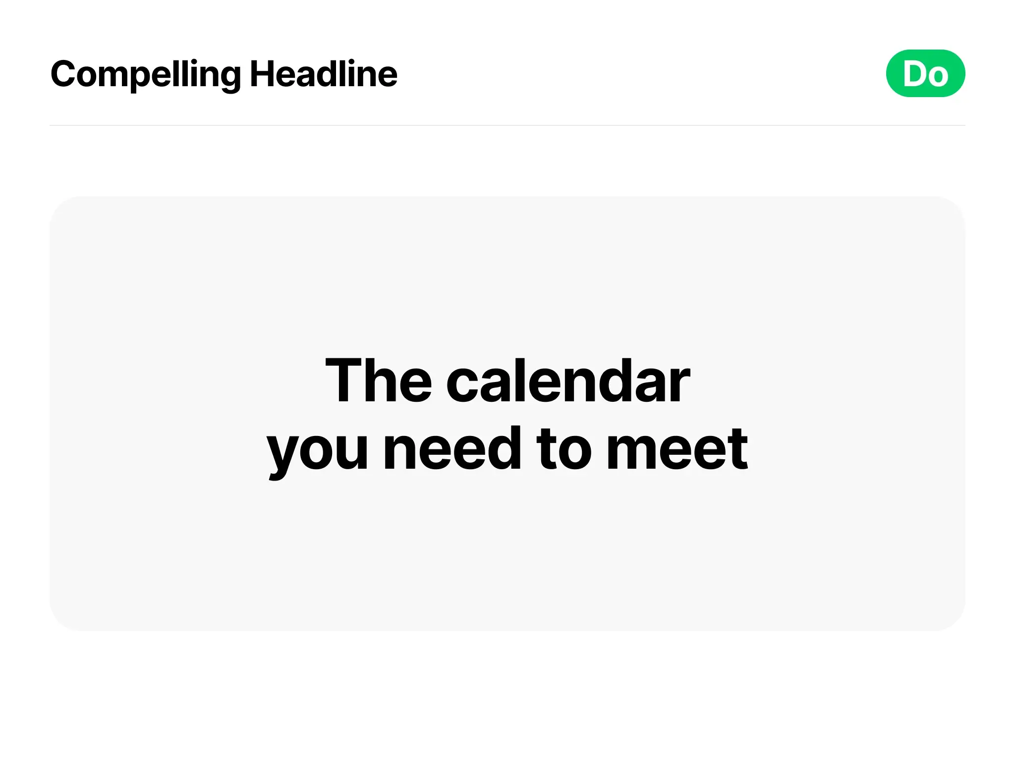
Your headline is the first thing visitors see. Make it irresistible. Use it to convey the unique value of your offer. Craft it with persuasive language that ignites curiosity about your services or products.
Focus on the User's Needs
Step into your audience's shoes. Understand their pain points and aspirations. Showcase how your offering can solve their problems or fulfill their desires. A landing page that resonates with visitors is more likely to convert them into customers. Use simple language while make your visitors feel understood and catered to.
Visually Appealing Design
Visual harmony is your ally. Design your landing page to be visually stunning, a reflection of your brand's identity. Use high-quality images, fonts that are as easy to read as a favorite book, and a layout that flows like a well-rehearsed ballet.
Your landing page should be a work of art, reflecting your brand's identity. If you need help with the UI/UX design of your website or landing page, MVST is happy to help! Just hit us up.
Loading Speed
In the digital realm, speed is king. Slow-loading pages are the equivalent of a closed door or traffic jams; people want to escape them. Ensure that your landing page loads swiftly. Optimize images and code to provide a seamless and frustration-free experience.

Mobile-Friendly
Remember, we live in a mobile world. Ensure your landing page is a welcoming host on all devices. Don't alienate potential visitors by neglecting mobile optimization. Mobile optimization isn't a trend; it's a necessity.
Strong Call to Action (CTA)
Your CTA is your virtual handshake, sealing the deal with your visitors. Craft it with precision. Use clear and actionable language that leaves no room for ambiguity. Tell users exactly what will happen when they click that enticing button.
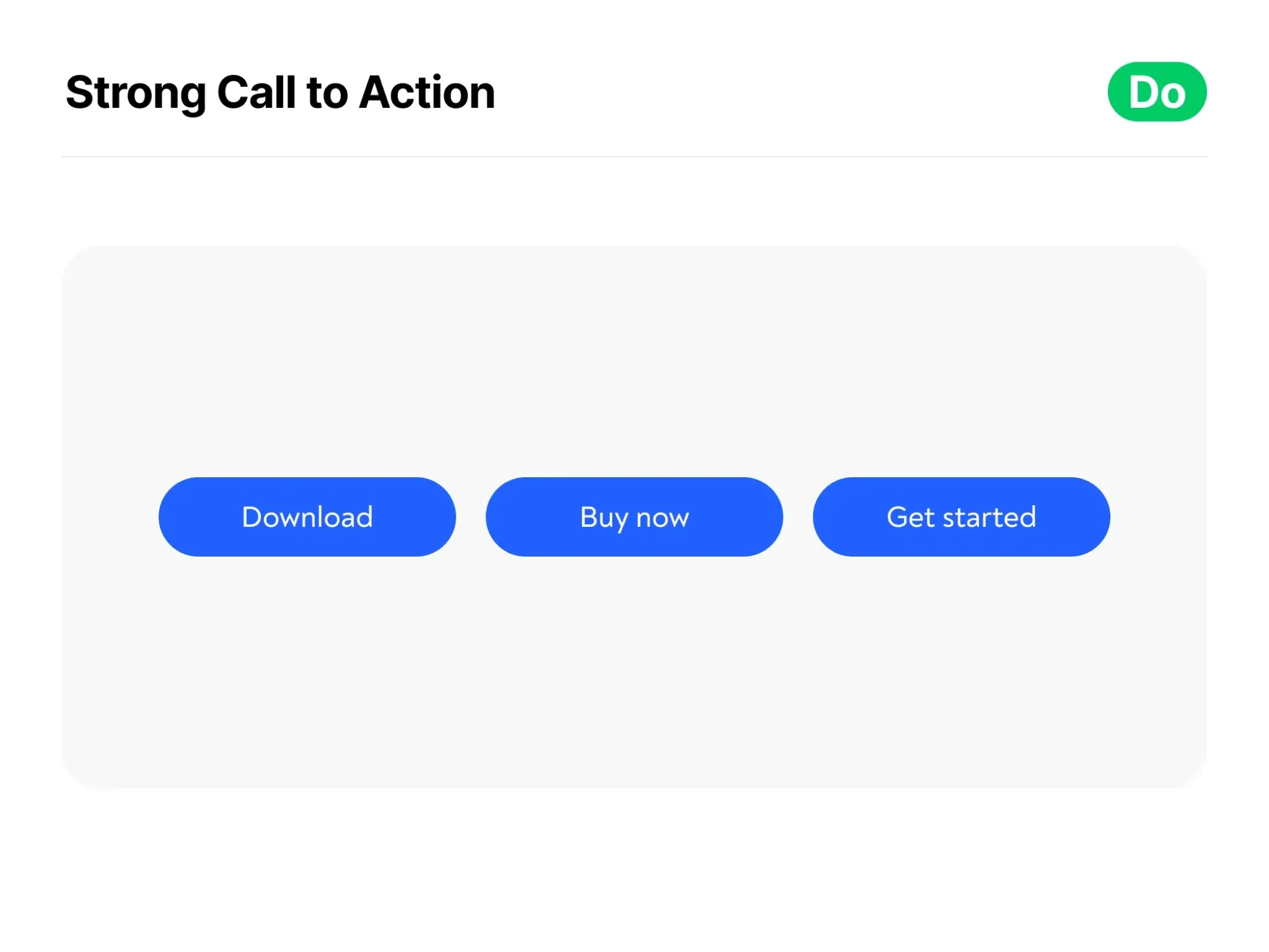
Common CTAs are "Download", "Read more", "Free Demo", "Buy now", "Get in touch", etc.
Social Proof
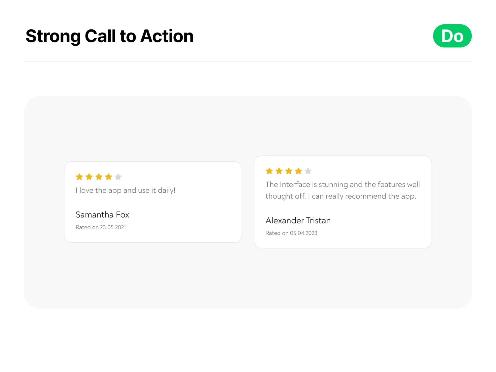
Trust is the cornerstone of online success. Bolster your credibility by incorporating testimonials, reviews, or trust signals like badges and certifications. When visitors see evidence of others' positive experiences, they're more likely to trust and convert. Just imagine yourself being the customer: When others vouch for you, it's easier for visitors to take the leap.
A/B Testing
Harness the power of data-driven decision-making. Conduct A/B tests on different elements of your landing page - headlines, images, CTA buttons - to determine what resonates best with your audience. Continuous improvement based on data leads to higher conversion rates.

Privacy Assurance
In an era of data concerns, transparency is your superpower. Clearly explain how user data will be used and provide a link to your privacy policy. When visitors trust you with their information, they're more likely to engage.
Concise Copy
Less is more, especially when it comes to copy. Keep your copy concise and laser-focused on your offer's benefits and features. Trim away unnecessary jargon and fluff to provide visitors with information that's clear, compelling, and relevant.
The Don'ts: Steer Clear of These Pitfalls
Ignoring Loading Time
A slow-loading landing page is akin to a slammed door in the face of your visitors. Neglecting loading speed can lead to high bounce rates and missed opportunities. Optimize every element, from images to code, to ensure your page loads with lightning speed.
Overwhelming Information
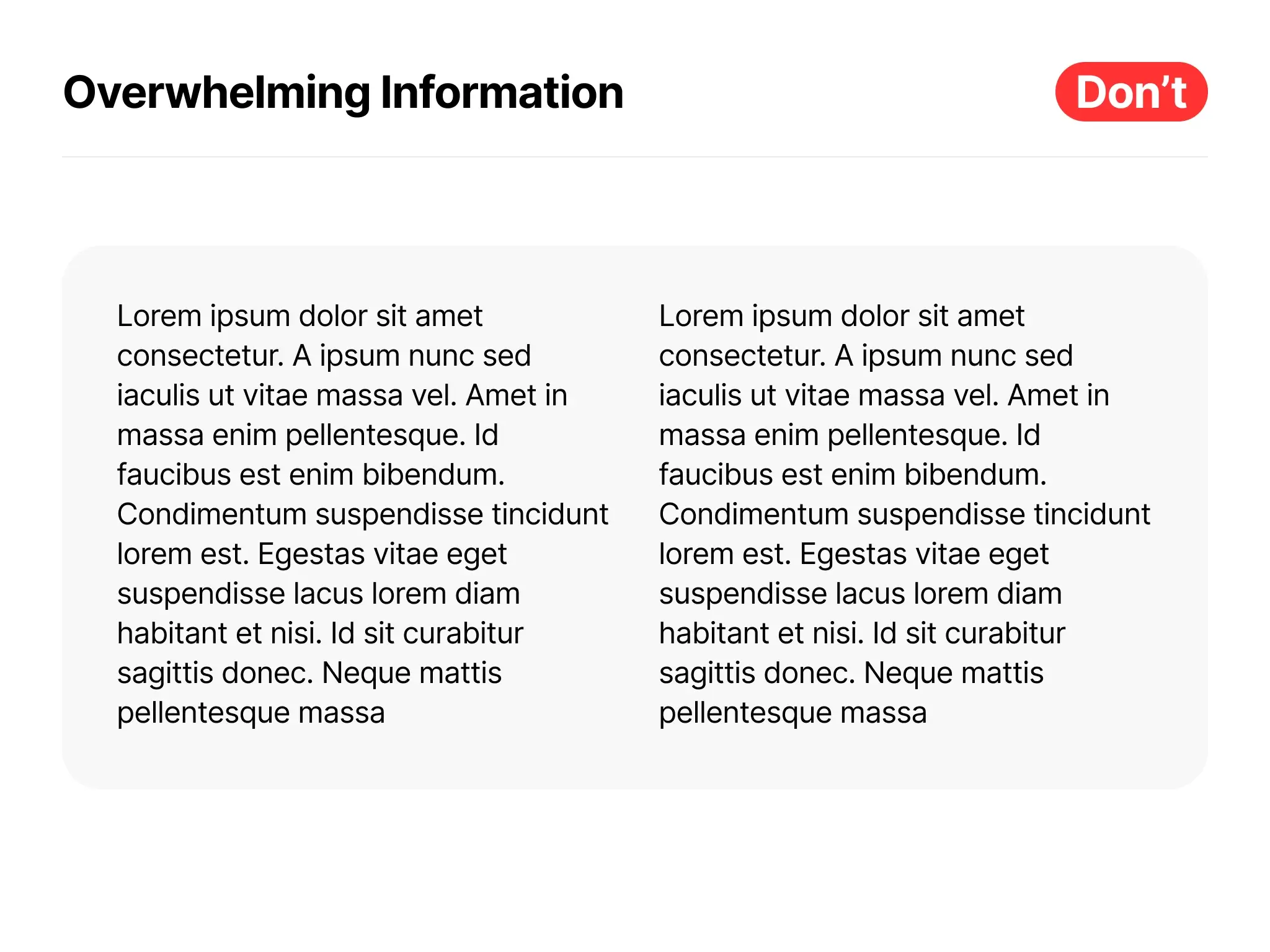
If we are completely honest, who want to read a page that has an overwhelming amount of text on it? Right, nobody. Don't drown your visitors in a sea of data.
Complex Forms
Complex forms are the roadblocks on the highway to conversion. Keep your forms simple, requesting only essential information.
Simplicity is sophistication!
Lengthy forms can deter users from completing the action you desire.
Navigation Links
Your landing page should resemble a well-lit path, not a maze. Remove distractions like navigation links that can lead visitors astray. Keep them focused on the journey towards conversion.
The most important link on your landing page should be the CTA.

Inconsistent Messaging
Keep your story straight. Your ads and promotions should sing the same tune as your landing page. Inconsistencies create dissonance, and dissonance scares visitors away.
No Testing
Don't play the guessing game with your landing page. Your initial design may not be perfect. Regularly test and optimize based on data and user feedback. It's an ongoing journey towards improvement.
This iterative process may take time but it's worth it. Your landing page will look top-notch with only essential, but excellent content und features on it.

Auto-Play Videos or Audio
Imagine a virtual page shouting at you as soon as you arrive. It's not a pleasant experience. Avoid auto-play videos or audio that disrupt the user's control over their experience. Let users choose when to engage with multimedia.
Neglecting Mobile Users
Mobile users make up a significant portion of your audience. Ignoring their needs is like neglecting a crowded room. Ensure your landing page is a seamless experience on mobile devices. Don't alienate potential visitors with an unfriendly mobile layout.

Lack of Trust Signals
Don't forget to display trust signals if you have them. Awards, certifications, security badges - these symbols of trust can reassure visitors of your legitimacy and encourage them to take action. Reassure your visitors; your offer is the real deal.
Ignoring Analytics
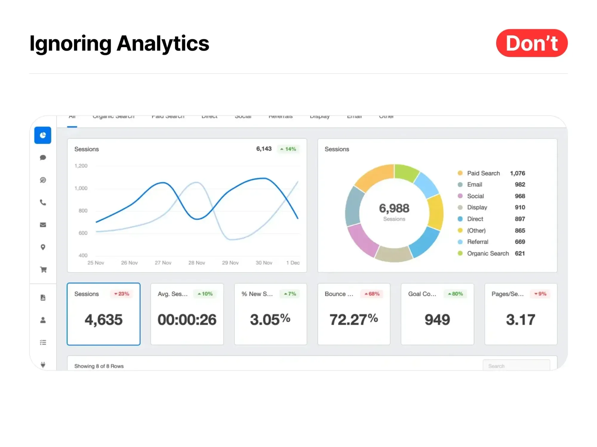
Data is your compass in the digital wilderness. Set up analytics tools to track visitor behavior on your landing page. Analyzing this data provides insights into what's working and what needs a facelift. It's like having a digital crystal ball, revealing what's working and what needs a makeover - the perfect guide for your optimization efforts.
Final Thoughts
So, as you dive into this guide, armed with the knowledge of what to do and what to avoid, envision the possibilities. Your next successful conversion could be just one optimized landing page away. What works for one audience may not work for another. Always keep an eye on performance and be ready to tweak and tune to ensure your landing pages continue to shine in the digital galaxy.
It's not just a webpage; it's your invitation to potential customers to explore what you have to offer. Seize this opportunity, and let your landing pages become the catalysts for your online success.

