

Breaking The Barriers, Making The Web More Accessible.
5.16 billion people use the internet on a daily business, and a big part of these people have a type of disability that makes serving the internet very difficult for them and sometimes even impossible. As you can imagine, this is not completely user-friendly, nor the goal of a website. In this article, we will outline our strategies for achieving accessibility compliance in our products, specifically our websites, and discuss the tradeoffs associated with each approach.
- Accessibility in Web Development
- Different Approaches to Make Websites Accessible
- Conclusion
Accessibility in Web Development
Accessibility (often abbreviated to A11y — as in, "a", then 11 characters, and then "y") in web development means enabling as many people as possible to use websites, even when those people's abilities are limited in some way.
"The Web is fundamentally designed to work for all people, whatever their hardware, software, language, location, or ability. When the Web meets this goal, it is accessible to people with a diverse range of hearing, movement, sight, and cognitive ability." (W3C - Accessibility)
Different Approaches to Make Websites Accessible
Statistics show that 15% of the world's population has some sort of disability. 4.9% of U.S. adults alone have a vision disability with blindness or serious difficulty seeing even when wearing glasses, requiring screen readers. Unfortunately, even though a major number of web users need accessible websites, the same stats show that 98% of websites worldwide have some sort of accessibility issue.
Here are different approaches to do so.
1. CSS/Web Components Frameworks
The easiest way to make a website accessible is to use frameworks that already have everything built-in without the need of worrying about any of the accessibility requirements.
An example would be to use Chakra UI or Material UI which provides a wide range of components such as Dropdown, Modals, Tooltips, and Menus, 100% accessible.
Pros
- No need to know much about accessibility standards.
- Easy to integrate for most of the frameworks available today such as React, Angular, VueJS, and even plain HTML/CSS.
- Built-in styles which are suitable for a generally good-looking website.
- Manages browser support for you.
- Makes it easy to build responsive websites.
Cons
- Very hard to customize styles for your specific design system. This is the main reason we don't use these quite often at MVST.
- The bundle size is usually big.
2. Do It Yourself
Why not build everything from scratch? After all, it's just a bunch of HTML attributes to add to our components.
Well, it might seem easy to build custom components such as Dropdown Menu or a Modal. We can use some position:abosolute and maybe a ref with some ARIA labels and that's it.
Pedro Duarte also thought at first he can build a Dropdown Menu in 1 single day. But here's his talk where he shares why this is not the case.
This already gives an idea of why we shouldn't build everything from scratch. It's time-consuming and we already have a better approach that has the best of both worlds.
Pros
- 100% customizable and adapted to your specific design system.
- You might have less bundle size (but not necessarily as you might also end up with more code than the framework itself has).
Cons
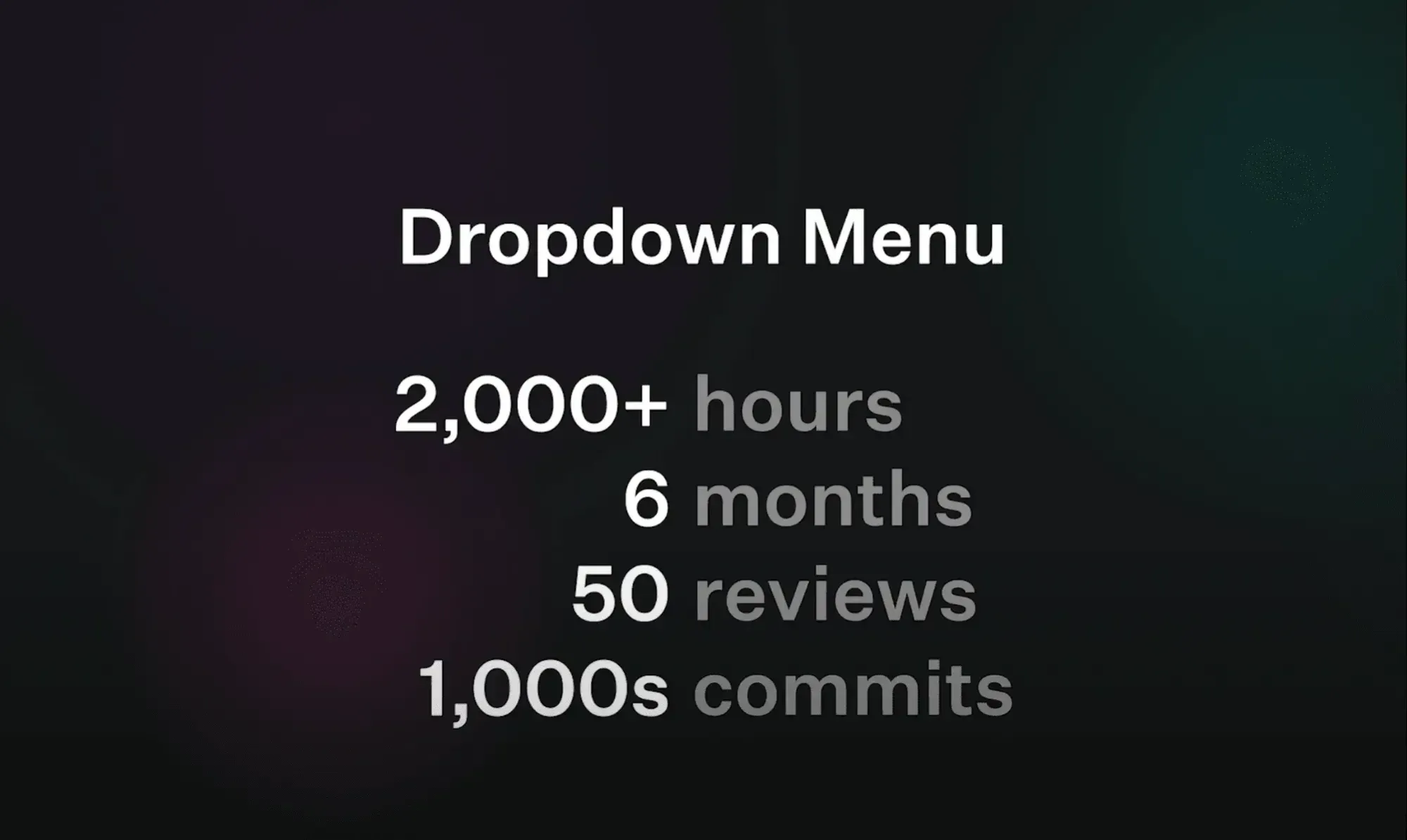
- 2000+ hours to build a dropdown menu is way too time-consuming.
- You need to be an accessibility expert.
- You need to make it available for major browsers, and sometimes for most browsers.
3. Unstyled Components (Or Headless Components)
In the context of web development, the word "headless" usually means without styles or without UI. So you're responsible for the styling.
Headless or unstyled components are fully accessible components with a simple API but with zero styles applied so you can use your own styles with plain CSS or a framework such as Tailwind.
This is what we use most at MVST as we're a Design-Driven Company and every website should be unique. Each client has its own brand and identity which we convert into a design system.
Example Of Headless UI Libraries
- Headless UI
- MUI base - This is what Material UI uses under the hood and they're exposing their low-level components for free.
- Radix UI Primitives
- Downshift
- React Aria - This one is built by Adobe.
- React Dropdown - This one is just for drop-downs and this gives you an insight into how difficult it is to build a dropdown fully accessible and customizable from scratch.
Most of these libraries have most of the components you might need for your website. Some of them are still in beta, and others are only specific to one component. But they all have the same philosophy:
Another important note (especially for React developers):
- Some libraries like MUI base or React ARIA provide hooks API.
- Libraries such as Radix UI provides only Components API.
- Other libraries provide hooks and Components APIS for most of their components.
Let's see the difference between hooks and components APIs.
Hooks API
import type { UseSwitchParameters } from '@mui/base';
import { useSwitch } from '@mui/base';
import { clsx } from 'clsx';

export function Switch(props: UseSwitchParameters) {
  const { getInputProps, checked, disabled } = useSwitch(props);
  return (
    <div
      className={clsx('switch-root', {
        'switch-root_checked': checked,
        'switch-root_disabled': disabled,
      })}>
      <div className={clsx('switch-thumb', { 'switch-checked': checked })} />
      <input
        onClick={e => e.stopPropagation()}
        {...getInputProps()}
        className='switch-input'
        aria-label='switch'
      />
    </div>
  );
}
Switch component example with MUI base hooks API
This is a simple Switch component. Fully accessible and 100% customizable, we're just using the useSwitch hook from mui/base. The hook returns the needed props getInputProps which we'll spread into the input component and we also get the checked and disabled props which we can use to style the component depending on its state. For this example, we are using different class names for different states.
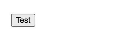
This is also a simple example from React-Aria for a Button component using Hooks API:
import {useButton} from 'react-aria';
import {useRef} from 'react';

function TestButton(props) {
  let ref = useRef();
  let { buttonProps } = useButton(props, ref);
  let { children } = props;

  return (
    <button {...buttonProps} ref={ref}>
      Test
    </button>
  );
}
Accessible button demo using React Aria
It's the same idea, we use the useButton hook to retrieve the buttonProps and spread it into our own component.
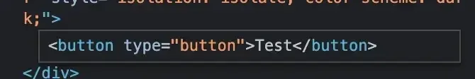
Our button is unstyled and this is how it looks in the picture below, but if we inspect it we can see the type=button attribute added for accessibility purposes. Read more about type=button.
Components API
This is an example from Radix Primitives.
import React from 'react';
import * as Checkbox from '@radix-ui/react-checkbox';
import { CheckIcon } from '@radix-ui/react-icons';
import './styles.css';

const CheckboxDemo = () => (
  <form>
    <div style={{ display: 'flex', alignItems: 'center' }}>
      <Checkbox.Root className="CheckboxRoot" defaultChecked id="c1">
        <Checkbox.Indicator className="CheckboxIndicator">
          <CheckIcon />
        </Checkbox.Indicator>
      </Checkbox.Root>
      <label className="Label" htmlFor="c1">
        Accept terms and conditions.
      </label>
    </div>
  </form>
);

export default CheckboxDemo;
Radix UI CheckBox Demo example
We're importing our different components from Radix-UI and then providing our custom styles.
If we inspect this component we'll see that we have all of the attributes we need to make it accessible.
<input type="checkbox" aria-hidden="true" tabindex="-1" value="on" checked="">
<label for="c1" class="c-kxiRoP c-kxiRoP-igwYzjZ-css">Accept terms and conditions.</label>
Html Input and label elements with attributes for accessibility
Let's now summarize the Pros and Cons of using unstyled components.
Pros
- 100% customizable.
- Minimal configuration compared to the DIY-approach.
- Makes website accessibility much easier to deal with.
- Small bundle size.
- Do it once and reuse it everywhere using the components approach for most web frameworks such as React, Angular, and VueJS.
Cons
- More responsibilities compared to using frameworks such as Material UI or ChakraUI etc.
- Takes some time to implement so it's not suitable for MVPs or projects that need to be done in a short period.
- Needs some time to get used to.
Conclusion
This article gave you opportunities on how to make the web more accessible (A11y) for individuals who rely on keyboards, screen readers or simply prefer keyboard interaction. We explored different approaches to achieve this and considered the tradeoffs involved.
In conclusion, we must prioritize accessibility in web development, enabling people with diverse needs to fully engage with the online world. By leveraging accessible libraries and tools, we can make digital products more inclusive while retaining our distinctive designs and creative vision.