

Atomic Design And Figma Dev Mode: Design-To-Development Made Easy

Imagine this: The designers created the most beautiful and outstanding mockups with super cool looks and animations in Figma. And then, when writing the code, the design looks off and the initial idea gets lost. The outcome is not corresponding with the intention of the designers. This is not just frustrating, but also extremely inefficient.
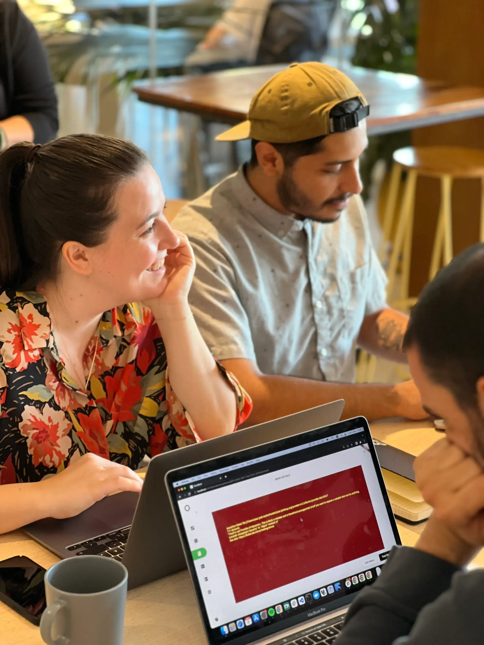
That's why we want to introduce you to Atomic Design and Figma Dev Mode: They are real game-changers in the world of UX/UI and development. These trends are taking the industries by storm, and for good reason. They combine the power of design with the flexibility of development to create a flowing work process without endless loops back and forth. Let's take a closer look!
- What Is Figma Dev Mode?
- How Does the Figma Dev Mode Enhance the Design-To-Development Process?
- What Is Atomic Design?
- How Can Atomic Design Bridge the Gap Between Design And Development?
- Conclusion
Figma Dev Mode - What Is It All About?
Imagine having a toolbox specifically designed for developers working on a construction site. Dev Mode is like that toolbox, providing all the necessary tools and resources developers require to bring designs to life. It helps developers easily uncover essential information like measurements, specifications, and assets, all within the familiar Figma environment.
It's a revolutionary approach that allows designers and developers to work together seamlessly, resulting in a truly collaborative process.
How Does the Figma Dev Mode Enhance the Design-To-Development Process?
This feature introduces a whole new level of flexibility. It's a great tool that adapts to your preferred coding language, offering redesigned code views and customizable options tailored to developers' individual needs.
Furthermore, it integrates seamlessly with popular tools like GitHub, Jira, and Storybook. For instance, think of it as a bridge connecting different parts of a city—the plugins facilitate smooth communication and interaction between various project management tools and the design file, making collaboration a breeze.
Additionally, Dev Mode streamlines the tracking of changes. It's similar to a highlighter, helping designers mark sections as "ready for development" and providing a comparison feature to spot any modifications made between different versions.
One of its standout features is the visibility of design tokens, serving as a map that guides developers through the design system. These tokens act like signposts, showing developers what details are needed and providing relevant documentation.
This launch marks just the start of Figma's efforts to bridge the gap between design and code, and deliver a more cohesive experience for everyone involved in the design process. Gone are the days of endless back-and-forth between different teams. With Figma Dev Mode, everyone is on the same page, working towards a common goal. By combining the best of both worlds - design and development - you can deliver cutting-edge interactive UI/UX design that leaves a lasting impression on your users.

With the help of Figma Dev Mode, developers can dive into the world of design without fearing the depths. Writing code for specific Figma designs is easier than ever! But what if the design is already done and only the code is missing? This brings up the very fundamental question in the design-to-development process:
How can designers and developers tackle the challenge of a disconnect between the developed outcome and the intentions of the designer?
You've probably experienced it before - a beautifully crafted Figma file that somehow looks off when translated into code, or the initial vision fades away along the way. But fear not! There's a solution to narrow the gap between designers and developers, and it's called Atomic Design.
What Is Atomic Design?
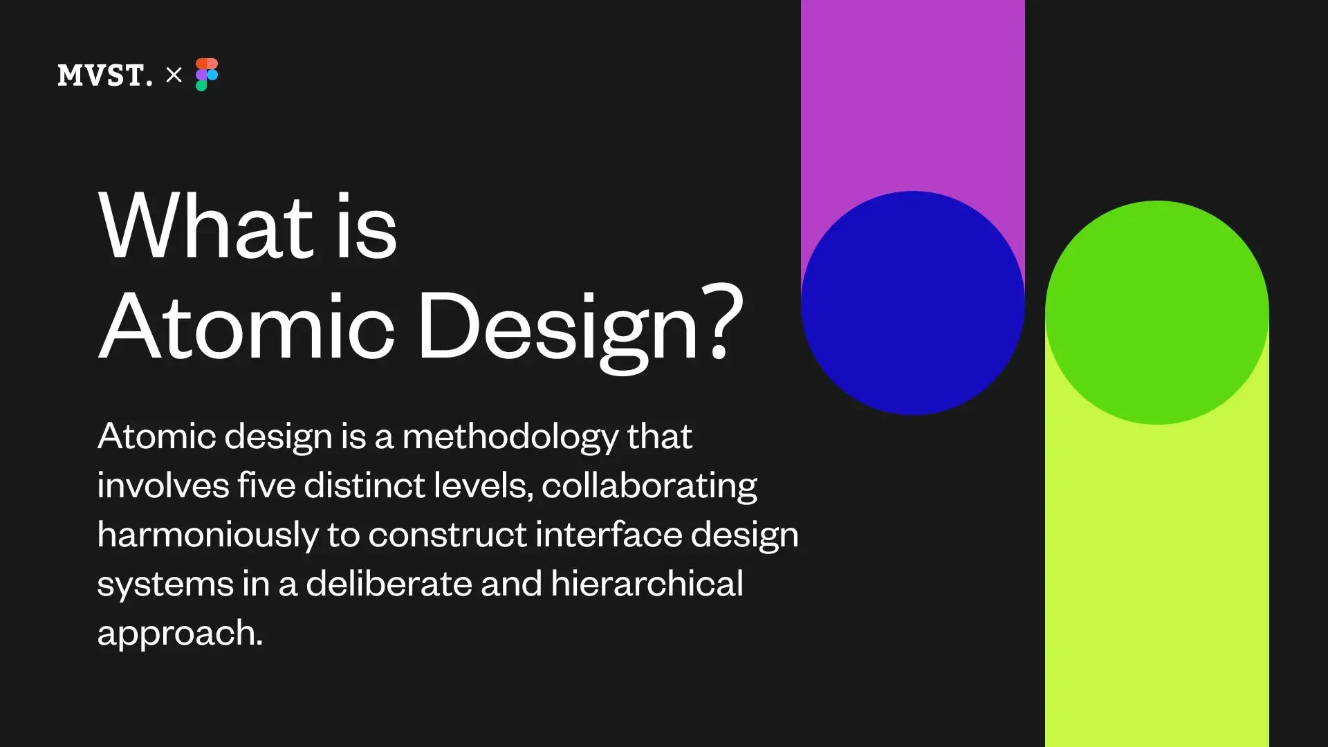
Introduced by Brad Frost in 2013, Atomic Design is a methodology for creating design systems. It breaks down the design process into five distinct stages:
- Starting with Atoms - the smallest functional elements like buttons and labels.
- These atoms come together to form Molecules, which are basic components like search bars or tabs.
- When molecules combine, they create more complex components called Organisms, such as a navigation board with a search bar and navigational points on profiles.
- These organisms are then arranged into Templates, which provide layouts for the design.
- Finally, the templates come together to form Pages, the final mockup.
How Can Atomic Design Bridge The Gap Between Design And Development?
The approach with Atomic Design is: Tackle the problem at it's roots and these roots are tokens.
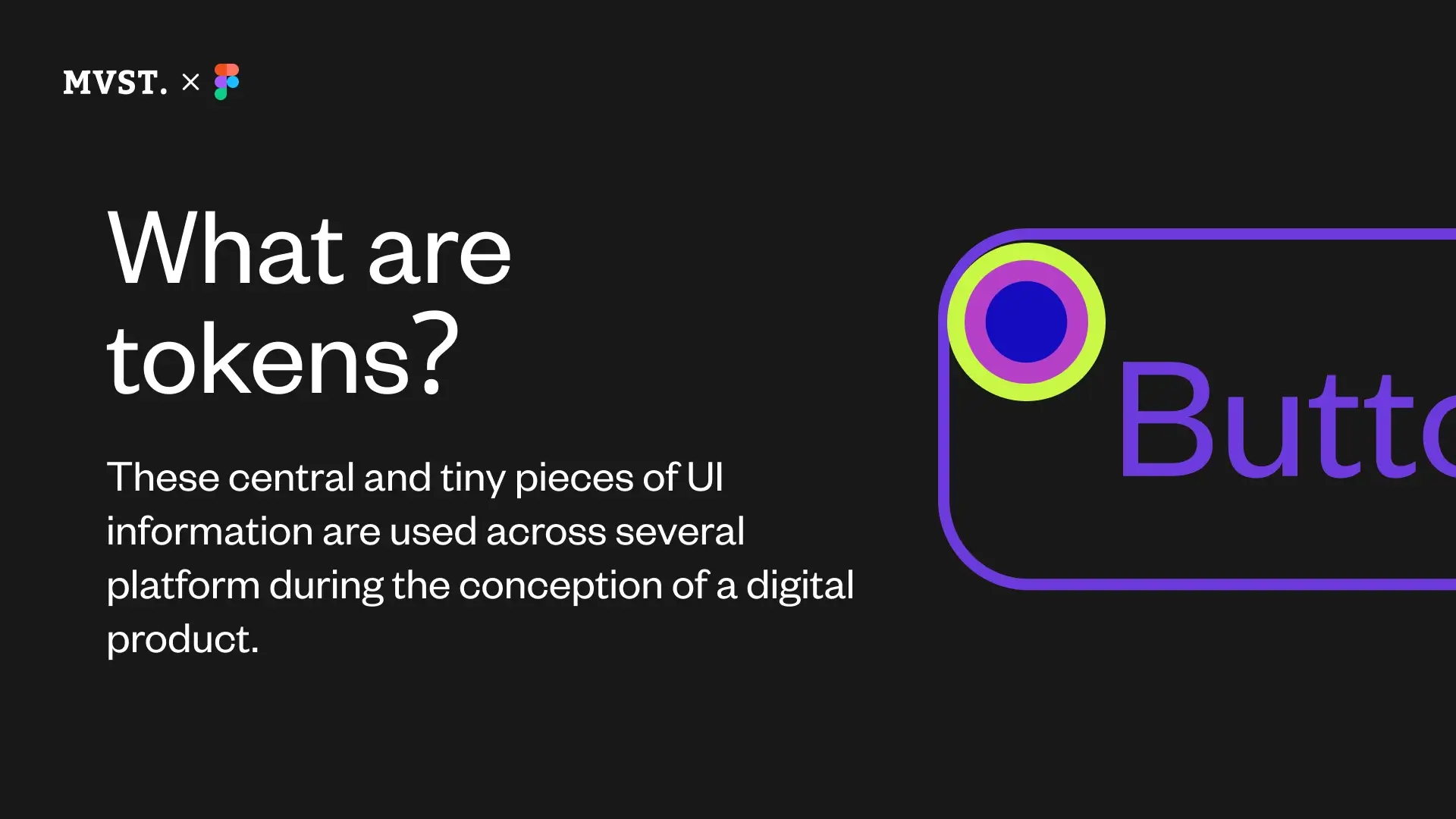
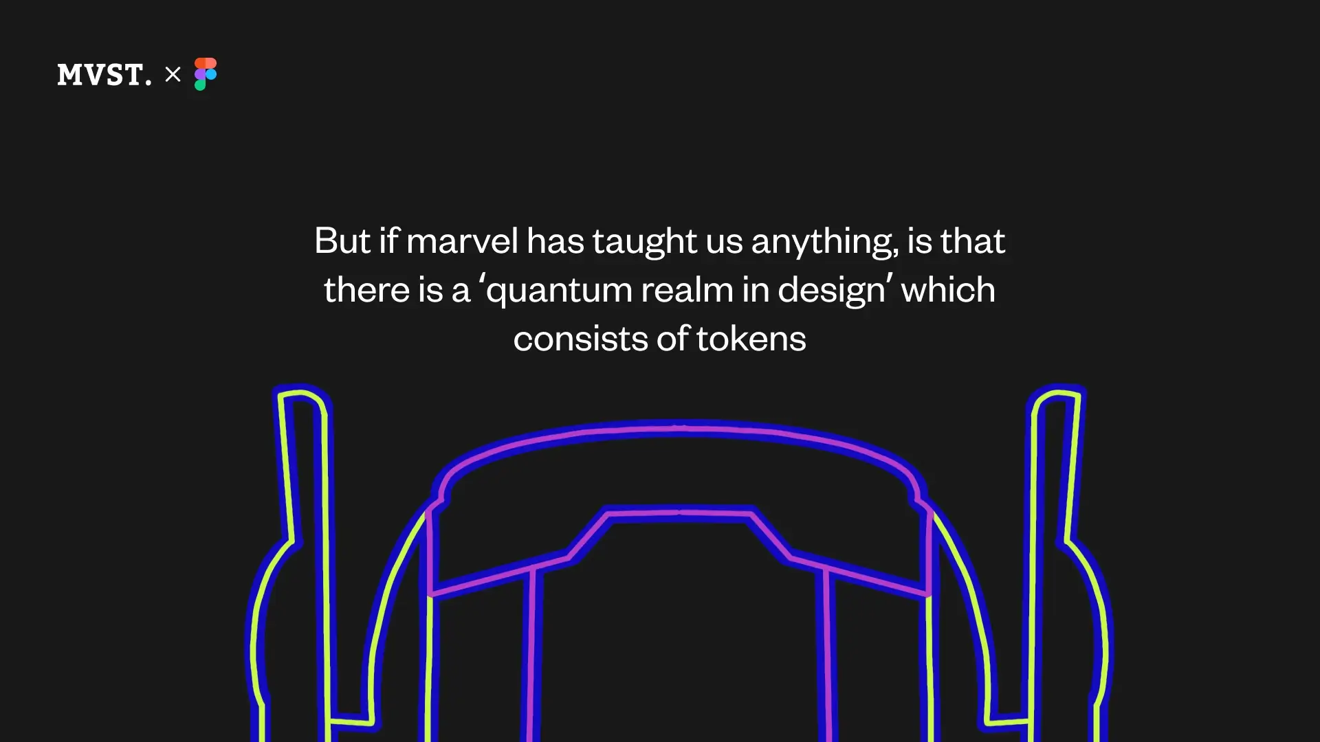
Here's where the magic happens - within this atomic design methodology, there exists a quantum realm of design known as tokens. In Figma, these tokens are referred to as variables. But remember: Every token is a variable, but not every variable is a token.
So, how do tokens benefit designers and developers? Tokens allow both parties to speak the same language, fostering better collaboration and ensuring brand consistency across every platform. By including tokens in the design process, designers and developers can tackle problems more precisely and efficiently. In fact, in the atomic design methodology, atoms are tokens - the smallest unit in design.
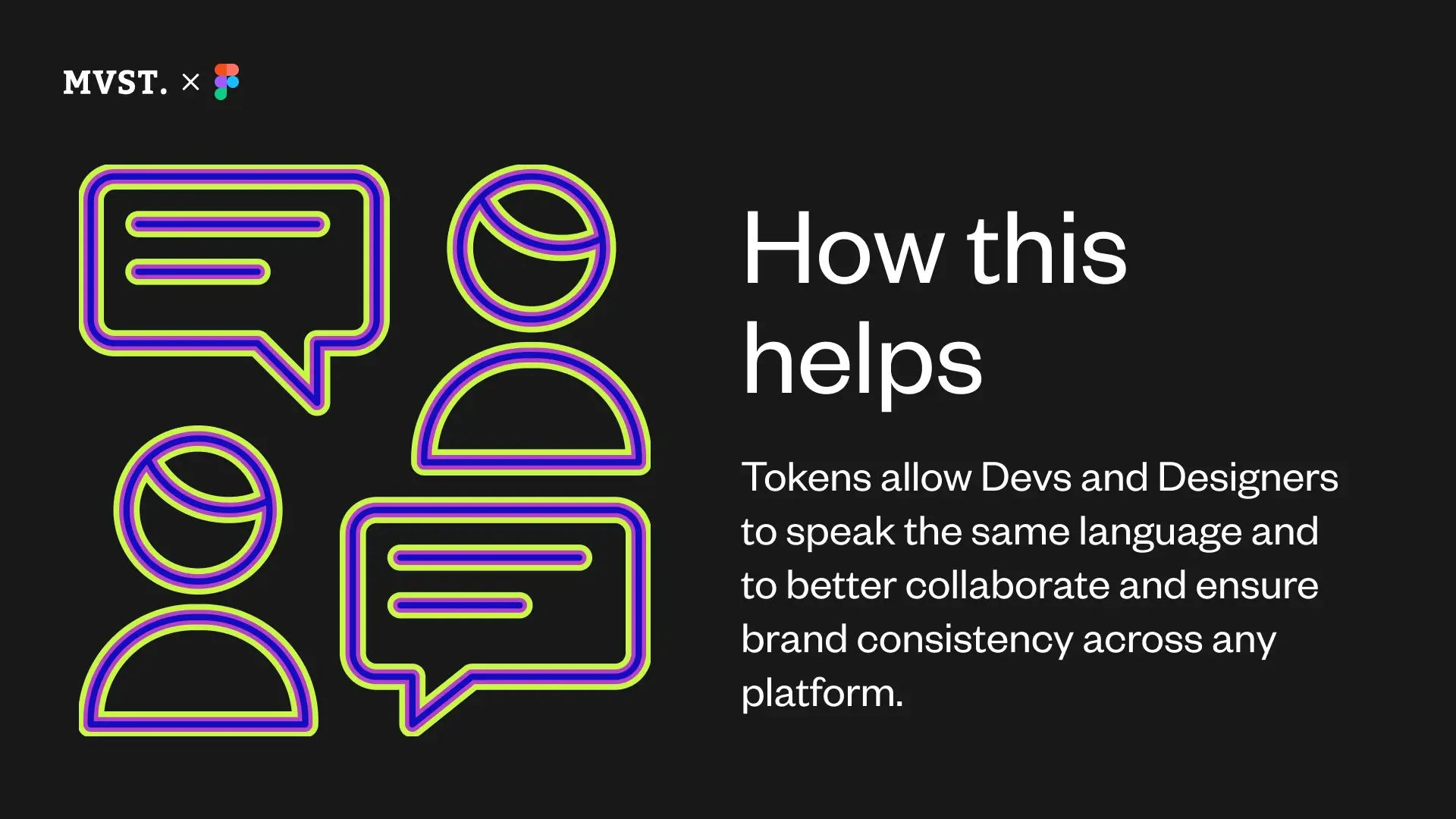
The beauty of tokens lies in their shared nature between designers and developers. They become the interface that brings both worlds together. Instead of working on the final page, designers and developers can focus on the atoms, variables, or tokens. They can make changes simultaneously and in the same way, sharing the same tokens. This is what we mean when we say designers and developers are speaking the same language. This alignment in approach significantly reduces the gap between design and development.
Imagine this scenario: a single element needs to be quickly changed. By working with tokens, both designers and developers can make the necessary adjustments effortlessly. You don't have to dismantle the entire project, spend a long time searching for the source of the error or start from scratch. Developers and designers can work in parallel, knowing that they are using the same tokens and achieving the same results. This seamless collaboration allows for a more aligned design process for both sides.
And the best part? After making changes, you can simply push them into production, and the background work begins. If any adjustments or tweaks are needed, they can be easily undone or modified. This iterative process ensures that the final product is a true reflection of the initial design intent - without loosing the intentional focus or getting rid of the original design idea.
Conclusion
Figma's Dev Mode and the Atomic Design methodology represent a revolutionary shift in the realm of UX/UI design.
Together, these tools empower teams to create cohesive and impactful designs, bridging the gap between design intent and final product execution. These are huge steps to ease the design-to-development process - we are super excited what the future hold!